September 27, 2013

Sketch reveal-SOUS

Another Friday sketch reveal for us girls over at SOUS.. For this weeks sketch, our very own Sandi Clarkson designed it and I had lots of fun putting some die cuts along with some hand made flowers together for this layout..

So, here is my take on this weeks sketch:
The photo is of one of the horses at the stable my daughter goes to.. 

how about some close ups:
I loved her tilting her head to one side as if so curious to see what my daughter was up to..LOL

Peek-a-boo..LOL She is actually missing an eye, but that doesnt interfere with her happy horsey life.. she had an infection and the doctors couldn't save the eye..

My hearts and butterfly..

Upper butterfly and the small blue flowers.. 

I cut all of the butterflies in threes and layered them.. adding some silver stickles!!

The yellow flowers are covered in glossy accents and diamond dust..

Finally the cute little birdie.. plus, the centers of the little blue flowers, I also added glossy accents and diamond dust to those..

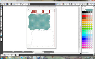
and here is the a photo of the virtual layout I created before anything was cut and glued down on paper:
Once again, copying and pasting the cuts onto a new piece of printable white cardstock, then cut them all with the Cameo.. inking the edges of the die cuts before assembly.. Pretty cool aye?.. kind of looks the same, with a few minor adjustments :)


for supplies used:

Yellow and white cardstock
Canon printer

Silhouette Cameo
Silhouette Designer edition software

silver stickles
foam tape
glossy accents
diamond dust
distress ink

SIL cuts: (will add links soon)
Bird
Music notes
flower1
flower2
branch with flowers
border
skeleton leaves
butterflies
hearts
tab

Ok ladies.. There ya have it!!  I'm so psyched you stopped by today and do check out the rest of our amazingly talented design team over at S.O.U.S
Have a scrap-tastic weekend
Hugs
Nanné

September 21, 2013

PPPR-Birthday Blog Hop-Guest Designer


Welcome to the Pretty Paper, Pretty Ribbons Birthday Blog Hop!!
Today we are celebrating Lisa's (owner/designer of PPPR) birthday! She had a plan for this hop, but the Design Team plus some guests ( I AM A GUEST DESIGNER) have a plan of our OWN because we LOVE her!!!! We are all making special birthday projects using some files from the Pretty Paper, Pretty Ribbons store AND since birthdays are all about celebrating with friends and giving gifts, we decided to add guests to the lineup and giveaway a TON of prizes!! These awesome prizes include fun twine, stamp sets and gift certificates to some of our favorite crafty stores!! You seriously do NOT want to miss a single stop in this hop!!


If you are coming to here from MELISSA'S blog you are in the right place!
If you have just stumbled upon this hop, make sure to head back to the Pretty Paper, Pretty Ribbons blog! But remember - and this is important! - Lisa does NOT have the correct lineup on her blog, because she doesn't know there has been a few ADDITIONS to the lineup thanks to her DT!! SURPRISE, Lisa!! Lisa will direct you to the correct blog, but after that please disregard her lineup!!
Now onto my project!!
I decided to use the Candy Corn guy cutting file (cause he is too cute) and created a Halloween themed Birthday card.. Adding lots of fun Halloween elements to the page, like bats and balloons in Halloween colors.. I also added a web border and created little candy corns from the main SVG file, just deleting the hands and feet :)
once I had assembled the card, I added some stickles to the die cuts.. Orange, green, black and purple.. plus, a few drops of white with a white marker and how could I forget to mention the Peachy Keen facial stamp..
The creepy hands, balloons, web boarder, party hat and bats are from the SIL store and the title was created with free fonts.. Printed paper is a digital kit..


Of course Lisa has an awesome package to give away to one lucky hopper!!
For a chance to win, you must be a follower of each blog and also leave a comment on each blog. For extra chances, you can also 'LIKE' Pretty Paper, Pretty Ribbons on Facebook and/or sign up for the Pretty Paper, Pretty Ribbons Newsletter. A random winner will be chosen for the prize on Tuesday, September 24th. Only US or Canadian mailing addresses please.
With our blog hop also comes a new Pretty Paper, Pretty Ribbons Challenge!! The theme of the challenge is Birthday and you can link up your projects at the Pretty Paper, Pretty Ribbons blog until Sunday, October 12th for a chance to win a $10 gift certificate to the store. We can't wait to see what you create using PPPR files!!


Now onto the next stop in the hop!! Head on over to NICOLE'S blog!!
Here is the CORRECT hop lineup in case you get lost along the way!!

Thank you for hopping by today..
Hugs
Nanné

September 20, 2013

Star-die cut reveal SOUS

TGIFriday and its time for another die cut reveal for us ladies over at Stuck On U Sketches.. For this weeks die cut challenge, we were asked to use a STAR shape on our projects.. Whether it be a cut out or an actual die cut.. I had lots of fun playing with some fun die cuts I found in the SIL store.. 
Here is my take on this weeks challenge:
I wasnt sure which photo I wanted for the layout, but then found one of my daughter taking a nap on our couch and thought it was perfect, even if the layouts a bit masculine, I think it works..LOL

hows a few close ups:

love the font

cute planets with a lot of layers..

my kiddo !!

stars and more planets..

and once again, I created a virtual layout in the SIL software:

Here is the virtual layout.. The globe I cut in half once I had stretched it to fit the bottom half of the layout..
Love the cutting tool feature!!  The fun part is placing the die cuts in just the right places.. I wanted the alien in the middle of the layout with the planets and stars surrounding it.. kind of like it hovering over the earth..LOL
Added the clouds just as a detailed element, since you can see the clouds from space and I also felt like the photo mat needed a little bit of something..

and then I just copied and pasted the die cuts onto printable sized pieces of white cardstock, printed them with my handy dandy Canon printer and then cut them with the Cameo.. inking and piecing them together took some time, but that's one of my favorite parts of creating a layout.. The love we put into our projects..

for supplies used:

Silhouette Design edition
Silhouette Cameo
Canon home printer

White cardstock
grey cardstock (background)
distress inks: Bundled sage, Dried Marigold, Tumbled Glass
chalks
white marker
foam tape
free font

Die cuts:

and there we have it again for this week.. 
Do stop by SOUS and check what amazing projects the rest of our design team has created for this weeks die cut challenge..
Hope you have a scrap-tastic week
Hugs
Nanné

September 13, 2013

Life is a Journey-sketch reveal SOUS

I've been dying to share this layout with you all and I created a bit of a step by step to how I create my layouts using the Silhouette design software..  This will be the first of many step by steps to come..
So, anyway....LOL  I loved this sketch by our Sandi Clarkson, who has since stepped down from our creative team, but before she left she was sweet enough to create a this months sketches and die cut challenges..
Here is the layout I created for todays reveal:
Photos are of my eldest son Aaron, who just turned 20yrs old in July..
I snapped these photos of him while he was sitting out back in our little court yard..

and some close ups:


and to share my little short step by step on how I design my layouts:


first of all, I start by creating a virtual layout on the mat in the design software.. 
Works with both CCR and SIL software..
I usually start by creating the background first, using the square tool I drag and create the 12x12 background, then fill it in with the background color of my choice.. with this layout, I decided to go with black.. makes all of the other colors really pop.. I chose a single color background because I will use this color from the paper stack instead of printing it..
By now, I have a basic concept of what I want to do, although I change my mind lots of times during the design process..LOL  I then decided to add a marquee for the photo base, added the globe next and then created the long circular arrow with the circle tool.. (create two circles, one larger than the other.. Click on one, then hold down the shift key and click on group.. once they are grouped, right click on the image and choose "Make Compound path", this will hollow out the circle.. I then used my cutting tool and cut a small piece from the hollowed circle, adding the triangle and welding it all together, filled in with a print..  A triangle is easy to create with the square tool, once your square is drawn, double click on it to edit and drag the two upper corners towards each other to the middle on the top line and there is your triangle)
I then placed the title phrase, chose the colors to match the layout and finally added the die cuts that fit my theme.. playing with the sizes to make sure they fit my layout and not over power or not fit the layout.  I also filled those in with colors and prints to match my color scheme.. This way, you can see which colors fit perfectly together before you begin printing and/or cutting the die cuts for your layout.. No more wasting paper!!
Once I am happy with the end result, I save the design and then I start to copy and paste all of the cuts onto a new tab/tabs and because my printer will only print up to a 8.5 x 11, I will have to play around to make sure they all fit ..
here are some photos of the separated cuts:


I will name and save the tabs, just in case my software crashes.. It has done so in the past and I've wasted time and cardstock, having to do it all over again..  
Once I've printed and cut everything, I will ink the edges of all of the die cuts with either distress ink or chalk ink before I piece them together,  then adding either foam tape  (to add dimension)  or ATG tape onto the backs of the cuts and  I will use my original design as a reference to put it all together.. At this point, I will do a final edit of the layout.. leaving something off or even adding something that wasn't in the original design.. for example, I left off the birds on a line which would of been located above the title phrase..
and at the last minute, I will then add small details like faux stitching with my white marker, etc..

and if you have any questions, please email me or find me on facebook and I'll be more than happy to help..

for the list of supplies to create this layout:

Silhouette designer software
Silhouette Cameo
Canon printer

8.5x11 white cardstock
12z12 black cardstock

Distress ink: 
Tumbled Glass, Bundled Sage, Fired Brick, Rusty Hinge and Dried Marigold
Foam tape
ATG tape
White marker

Linked Die cuts:

I hope this post has been helpful and I will keep creating step by step tutorials for you so you can play with your software and get the best layouts designed..
I want to thank you for stopping by today and checking out my post :)
I hope you stop by SOUS and check out what amazing layouts the rest of our design team has created for this sketch challenge..
Hope you have a scraptastic week
Hugs
Nanné

September 6, 2013

My Happy Place-Die cut reveal SOUS

Us girls are having another die cut reveal today at SOUS and for this week, we have a fun and easy challenge for you.. to use a GATE on your project!!

I decided to create a layout for my daughter's horse album and used lots of die cuts on it.. I had a bunch of fun putting this layout together:

The cute little sheep I created myself.. I just added a bunch of small circles together and welded..
Super simple and lots of fun..

How about some close ups:

Its easy to add your faux stitching with the Silhouette software and you can add it in any color, I prefer white when ever possible :)

close up of my cute little lambs.. the head I created making a oval, that I then edited. pulling on the bottom of it to make it long, the ears are also ovals, but this time I pushed the sides in creating the flap look.. I then welded them all together creating the head :)

the crow is a cutting file I found in the SIL store..
You will find a direct link to the cut down in the supply list :)

side view of the trees.. I inked the edges with Bundled Sage distress ink and then used a pencil to bend the branches forward..
the gate is attached to the layout with foam tape to add a bit of dimension..

The cute little barn and silo I created.. The stable where the horse is at is red, so its why I added the barn and silo to the layout :) and the white faux stitching is printed onto the die cuts using the Silhouette software..
Here is a link to a tutorial on how to create the Faux stitching, its not my own video..

for a list of supplies used:

Silhouette Cameo
Canon Printer

Silhouette designer edition software
White cardstock
digital papers: Mysweetshoppe
Free fonts

distress inks: rusting hinge, tumbled glass and bundled sage
foam tape

Die cuts: Silhouette Store
Flowers (the center flower)

Scalloped square and sheep I created myself :)

Well, there ya have it ladies.. I hope my post was helpful and I hope you get some fun projects created with those adorable die cuts I linked for you..  I've had some requests for tutorials on how I create my layout, so hopefully I can get some made for you real soon.. Just trying to find some free time seems like an impossible task..LOL
Do stop by SOUS and check out what amazing projects the rest of our amazing design team has created for this challenge..
Have a scrap-tastic weekend..
Hugs
Nanné